SF Salud
Mutual health insurance company founded in 1924 compromised with their members' benefit in order to always provide them the best health coverage and with a very warm and close relationship with all their affiliates just as if they were a big family.


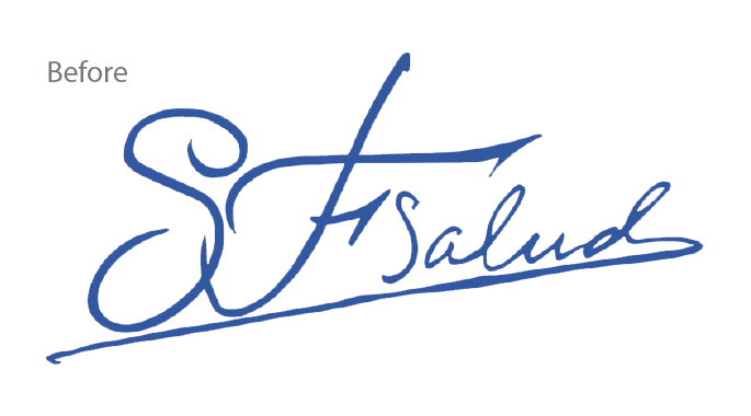
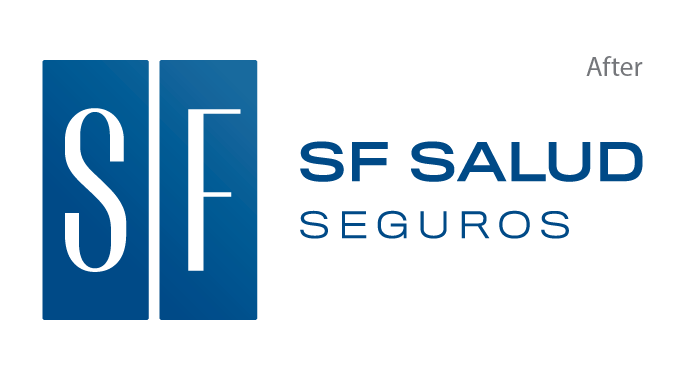
The new version replaces the old signature style logo with a sans-serif wordmark and a symbol what increases the legibility of the whole logotype across all platforms and gives a message of modernity and confidence to the audience.
Positioning the brand
Although the fierce competition within the industry, this boutique insurance company managed to thrive and offer a competitive service to the market. However, few resources were spent on branding so far and amongst competitors there were enterprises with huge marketing budgets. So, it was time to take part in this battle and position the brand in our audience's minds.

The brand promise, expert-to-expert insurance services, summarises the philosophy of the firm where every member is considered an expert in their daily life's needs while the company becomes an expert in providing insurance solutions to properly satisfy those needs.
The brand promise
After several meetings, it was clear that their particular vision of the business were what made them endure. That philosophy of becoming a big family where every member needs were listened to by their personal agent was a strong reason to believe and a powerful brand promise. It was necessary to come up with a tagline that could precisely summarise that concept, allowing them to define themselves and make them stand out from competition.

Concept
That new philosophy helped to define all the verbal and narrative assets that were all gathered in a brandbook.
- Brand Purpose
- Values & Attributes
- Tone of voice

Design
Corporate identity was updated and all the visual assets were gathered in the brand guidelines and toolkit.
- Logo & Brand assets
- Imagery & Iconography
- Visual Toolkit

Implementation
Every touchpoint was aligned from their website to their policy brochures or signage at their facilities.
- Digital
- Offline
© 2021 Jaime Doménech - Creative & Brand Consultancy