Ilex
Real estate developer with more than 25 years of experience and specislists in the residential sector. Highly recognised by their focus on design, innovation and quality on every project as well as the thoroughness of their integrated spaces, where every detail has been carefully conceived.
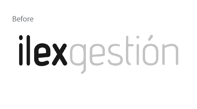
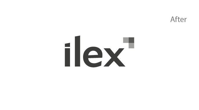
The new version disposes of the generic noun "gestión", management in Spanish, to create a much more memorable and commercial naming. Additionally, a three squares arrow turns up at the very top right corner of the wordmark that will become a distinctive and catchy visual asset for all their communications.
A brand architecture conceived to grow
After some meetings it was clear that the brand architecture had to manage to both allow distinguish every property with a different name and coming up with a common thread that allowed the audience to recognise the mother brand. Therefore, it was decided to adopt a monolythic brand architecture model with no difference amongst them but their property descriptor and their color.

Homes to live in
From the very beginning we agreed that building homes to live in was their brand promise. However, the concept of living differs for everyone. For that reason, the brand narrative had to be flexible enough to accommodate all different ways to enjoy your new home and at the same, as it happened with the brand architecture, be always easily recognizable and attributable to the brand.

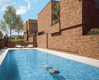
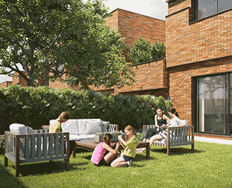
A welcoming message to every way to enjoy your new home: from dinners with friends, endless naps to a new domain for your pet or unforgettable moments with your family.
Concept
That new naming and brand architecture helped to define all the verbal and narrative assets.
- Brand Naming
- Brand Architecture
- Messaging
Design
Corporate identity was updated and all the visual assets were gathered in a toolkit.
- Logo & Brand assets
- Imagery & Iconography
- Visual Toolkit
Implementation
Every touchpoint was aligned from their website to their brochures and stationery.
- Digital
- Offline
© 2021 Jaime Doménech - Creative & Brand Consultancy