Gestair
National leaders in executive aviation services and amongst the top operators in Southern Europe helping clients around the world both for their private jet charter needs as well as for the management and maintenance of their aircraft.


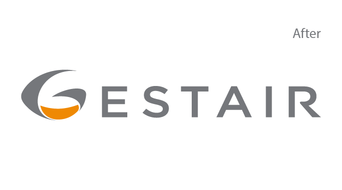
The new version simplifies the logotype into an only wordmark and replaces gradients with flat colors what increases the legibility of the whole logotype and guarantees a better performance across all platforms.
Positioning the brand
After a long period of ups and downs the firm managed to reestablish and it was time to reposition the brand in order to find their spot amongst competitors, counter that blurry image acquired through the years and show the market the extreme change the company had conducted.

The brand promise, a pledge to take care of everything in order to allow clients to stop worrying and start simplifying the way they fly.
A memorable brand promise
It was necessary to come up with a new philosophy that could perform like a beacon of light for the company strategy as well as an attractive and distinctive proposition for all the different stakeholders.Their board's commitment to helpfulness was what inspired the idea of simplification in the sense of taking care of everything in order to prevent their clients from worrying about anything and simply fly.

Concept
That new philosophy helped to define all the verbal and narrative assets that were all gathered in a brandbook.
- Brand Purpose
- Values & Attributes
- Tone of voice

Design
Corporate identity was updated and all the visual assets were gathered in the brand guidelines and toolkit.
- Logo & Brand assets
- Imagery & Iconography
- Visual Toolkit

Implementation
Every touchpoint was aligned from their website to their brochures or booths at international trade shows.
- Digital
- Offline
- Trade shows
© 2021 Jaime Doménech - Creative & Brand Consultancy